Designing coherence:rebuilding the heart of Quantcast.
A decade of world-class machine learning, two failed attempts at a self-serve DSP, and one design practice that reoriented an entire company toward product truth.
San Francisco · Hybrid
Five years
Shipped · 2021 GA
INTRO
Quantcast had spent a decade building world-class machine learning for audience prediction. What it wanted to build was a full self-serve programmatic DSP: campaign planning, setup, launch, optimization, and reporting in one platform, with those predictions running through every stage. It tried...and failed. Twice.
The third attempt is the one that shipped: launched in 2021, a 44% increase in conversions and 50% faster campaign setup than competing DSPs (Forrester TEI), adopted by brands like Yokohama and GroupM.
The difference between the failures and the success wasn't the design of the screens: it was the design of how the company made decisions. That was the project I worked hardest on for five years — the interface was just the visible part.
- Role
- Principal Product Designer (IC)
- Team
- PMs, engineers, data science, legal, sales, support
- Scope
- Platform strategy · Research practice · Evangelism · End-to-end UX
The company had lost its memory.
I joined during what leadership openly called a "come to Jesus" moment: a collective realization that data science alone wasn't going to produce a product marketers could use. The symptoms were everywhere: fragmented tools, competing internal visions, no marketer personas, no journey maps, no validated strategy. Previous attempts had shipped assumptions, not answers.
The root cause was quieter. Quantcast once had a research department staffed with brilliant people. Their findings had been shelved, their reports forgotten, and when they left, nobody refilled the roles — because nobody could point to a decision their work had changed.
The company hadn't just stopped doing research. It had lost the organizational memory that research ever mattered.
You can't fix that with a redesign. You can only fix it by making evidence impossible to ignore.
Findings, not guesses.
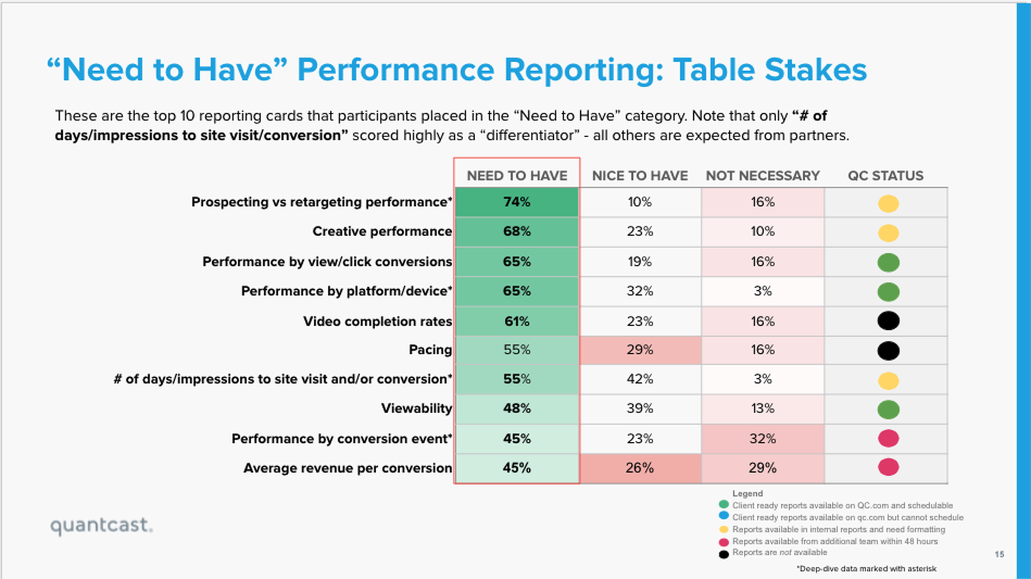
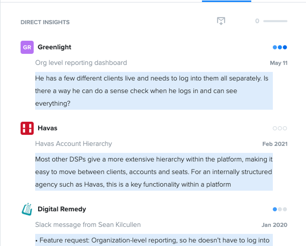
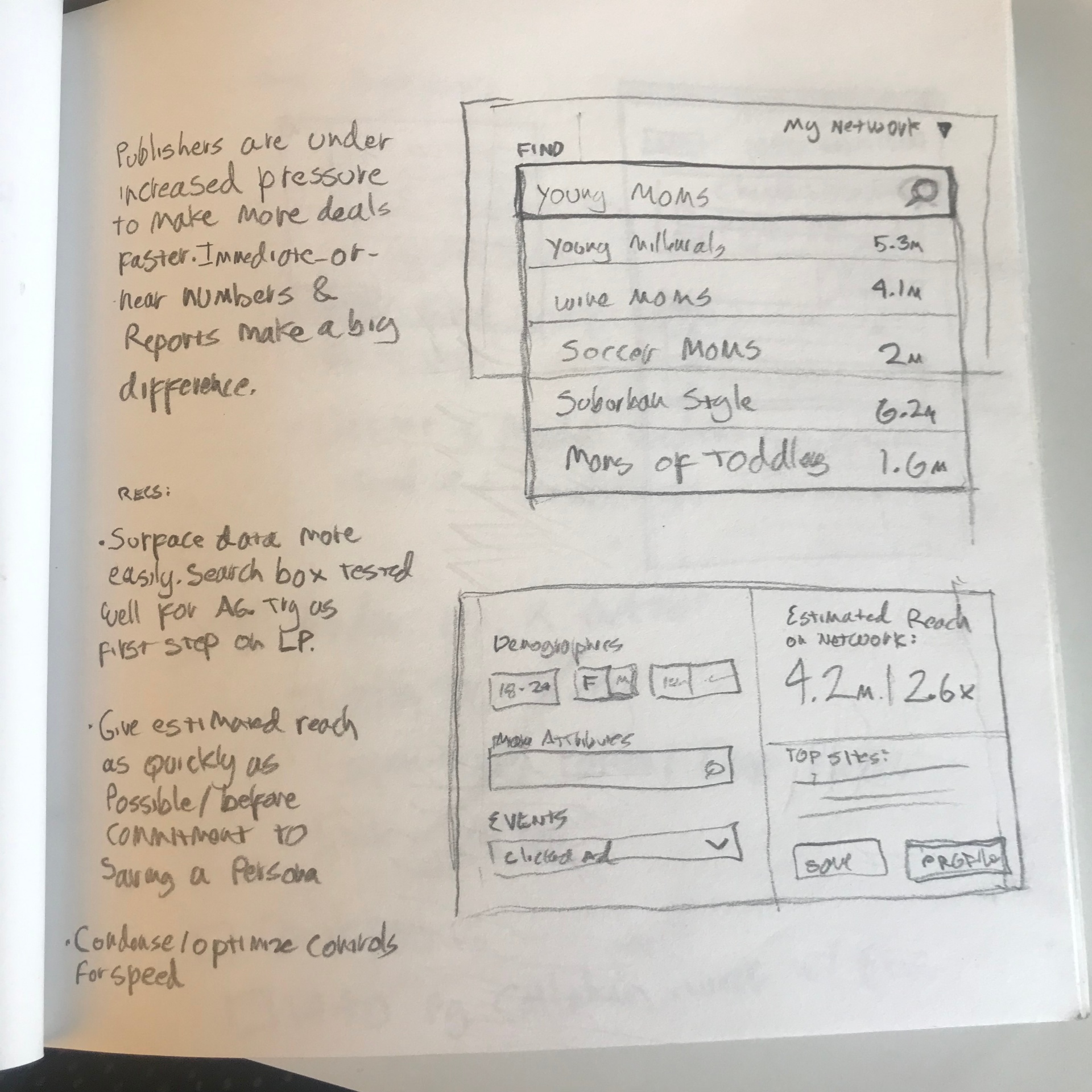
My first move wasn't generative research, it was excavation. As part of my own onboarding, I dug up every piece of prior research touching my domains and had conversations with anyone I could find who talked to users. Buried in shared drives, Slack threads and CS tickets were true gems: validated user problems, tested hypotheses, insights that answered questions teams were currently arguing about from scratch.
So I put them where arguments happen. I filled high-traffic areas with findings posters. I wallpapered rooms with hypotheses. I circulated the strongest insights in every planning conversation I could reach. It was cheap, slightly theatrical, and it worked: people started citing findings instead of guessing, and — more importantly — started asking why we didn't have newer findings.
That question was the opening. Demand for research had to exist before a research practice could.
Research is a muscle, and I trained it across departments.
When I joined, discovery had become PM territory, done unevenly. Some PMs ran lean, hypothesis-driven sprints; others worked waterfall and shipped beliefs. The breaking point for me was a trip I found out about after the fact: a group of PMs flew to LA to visit some of our biggest clients... and came back with strong opinions and firm conclusions built on impressions nobody could quantify.
So I pushed hard for designers to be included in every discovery interview, usability test, and client trip. It added travel expenses, which made it a fight. I sold the idea to PMs who got it, and they helped me win. It paid for itself exponentially: designers came back with rigorous, well-documented findings that got published, shared, and used to make decisions. The difference between an opinion and a finding is documented data, and we finally had that.
The test that changed the roadmap
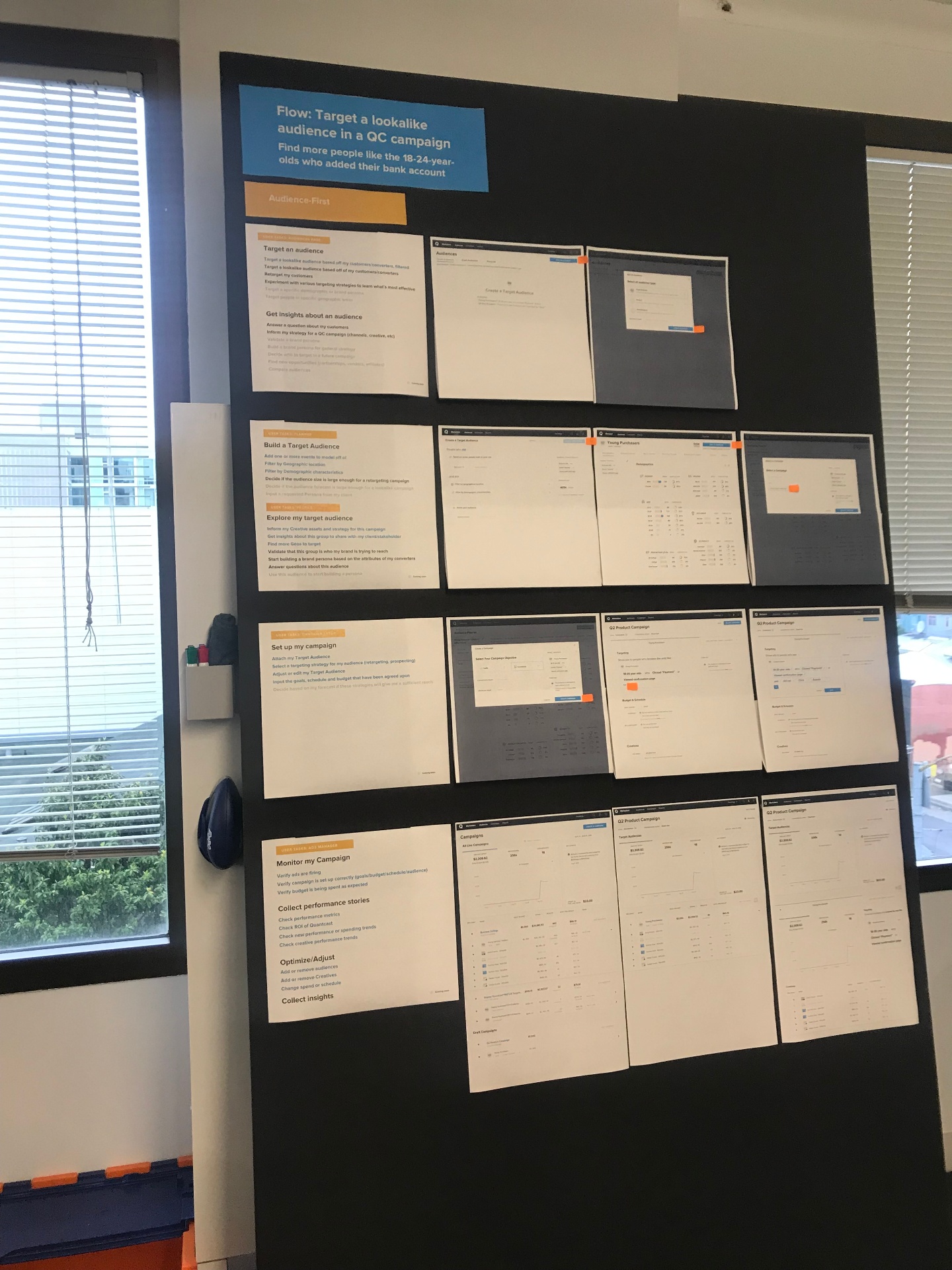
The org was deeply attached to audience-first campaign planning — it was the platform's organizing thesis. I had a feeling it didn't match how marketers actually thought. But our usability sessions couldn't tell us: we were testing with long-time customers who had absorbed our weirdnesses years ago, and even they needed the new flow explained to them. That's not validation; that's habituation.
So I recruited on LinkedIn for people in our target persona who had never seen the product at all, and brought them into the office for the first onsite usability test the company had ever run — recorded, and streamed live to viewing rooms where teams watched together. I built the event up deliberately; I wanted an audience.
Every single participant stumbled on the same unstated hypotheses about why our way was smarter. Afterward I made six-foot posterboards of the findings, emailed them company-wide, and led the discussions about what we'd learned. It got people talking — and then it got the flow reworked, by decision at the highest levels.
Nothing converts a skeptic like watching a real marketer get lost in your flow — live, in a room full of their colleagues.
I couldn't be in every meeting. So I trained the people who were.
None of this was smooth, and none of it was fast. It took about a year and a half for the practice to really get cooking, and the process itself was under constant iteration the whole way — what worked with one team got refined before it reached the next.
Standardizing user-centered practices meant friction with people who'd shipped fine without them...and for a stretch, the Design Director role sat empty, which meant no air cover. Progress ran on persistence, receipts, and picking battles where the evidence was strongest.
But the real scaling mechanism was the rest of the design team. We were small and tight, with designers embedded across product teams, and I treated that as distribution and coached them on the specific skills the culture change required: presenting data-driven hypotheses instead of opinions, asking for inclusion in discovery before it was offered, claiming seats at visioning tables, making PMs feel like partners instead of adversaries, and — hardest of all — saying no in ways that landed without drama.
A practice that lives in one person isn't a practice — it's a dependency.
Then we hired a director who backed the approach completely. With her leadership amplifying what had been a ground-up, designer-by-designer campaign, user-centered practices finally reached every working team: hypothesis-based design cycles (define use case → prototype → test → refine), embedded feedback loops across the product lifecycle, and research as a standing input to roadmaps rather than a rescue mission after launches.
We weren't designing a new UI: we were designing a new nervous system.
The product this practice was intended to produce: a full self-serve DSP where planning, setup, launch, optimization, and reporting flow as one continuous system instead of siloed tools — with ML-driven audience intelligence surfacing at every stage, actionable without overwhelming the marketer. Transparency, speed, and in an industry defined by opacity, something close to inspiration and excitement.
Mapping what we knew and what we didn't
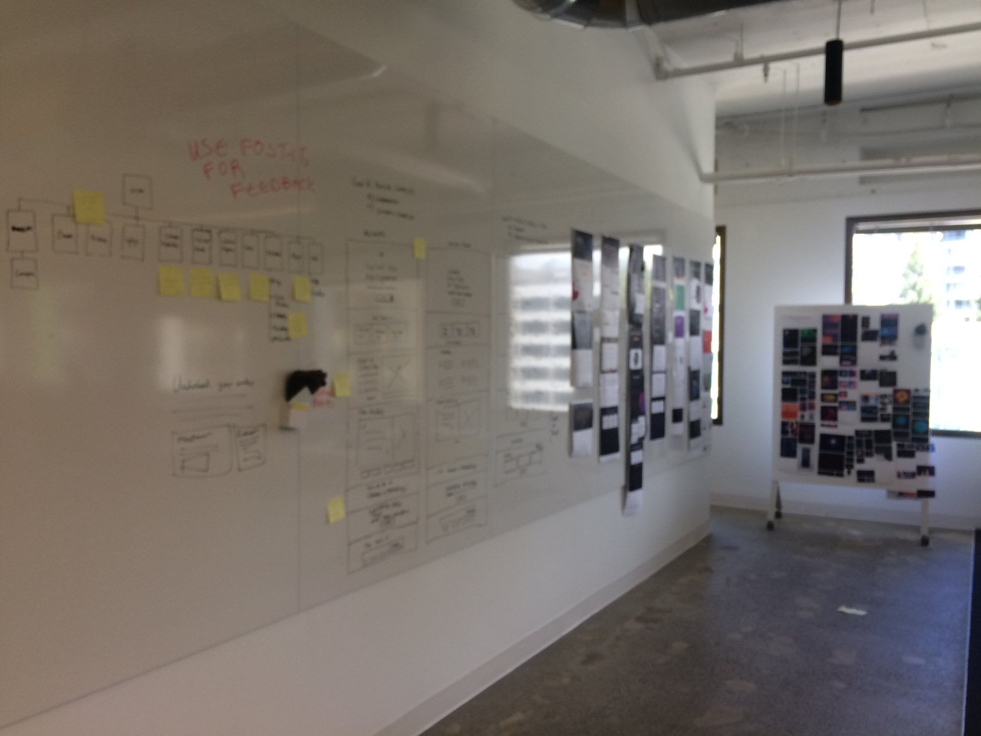
To get serious about addressing the cohesion problem, I teamed up with a forward-thinking PM and ran a workshop unlike anything the company had tried: developers, PMs, customer success, and sales together building one enormous journey map — a wall of stickies organized by persona, campaign phase, jobs to be done, and tasks. I based the method on Indi Young's Mental Models, adapted to be faster and more fluid so a cross-functional room could build it in real time.
Two things came out of that wall. First, direct action: a surprising number of stickies converted straight into Jira tickets. Second, and more valuable: the gaps became visible — you could literally see the regions of the customer journey where we knew almost nothing, which became the research agenda.
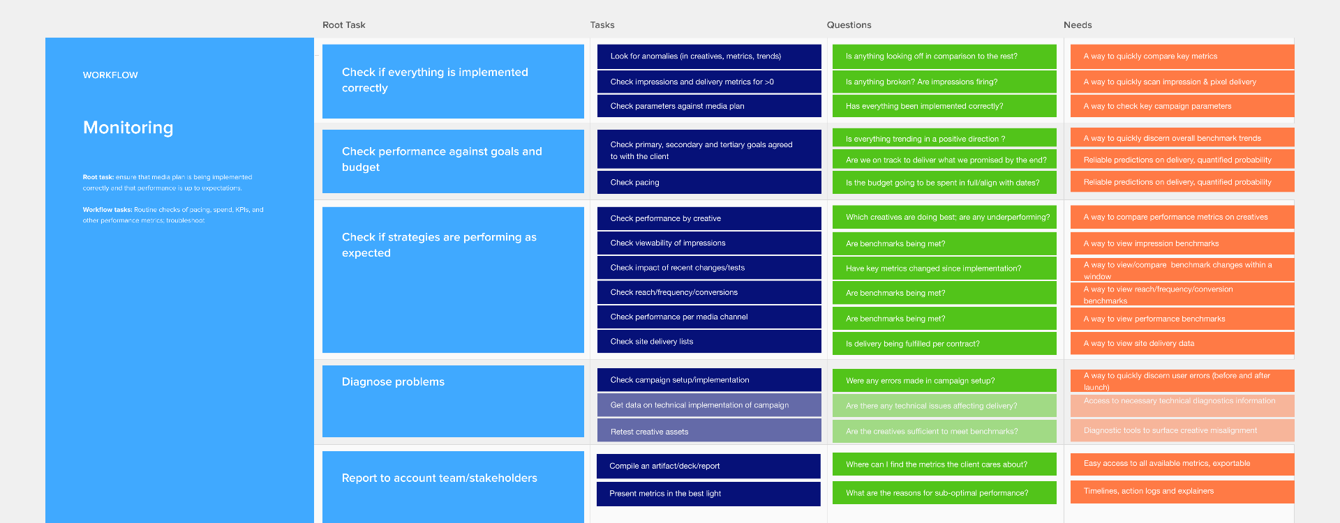
I then synthesized the wall into a circulating artifact of my own design: for each workflow, a chain from root task → tasks → the questions users are actually asking → the product capability each question demands. I'd never seen this format anywhere; I made it up because we needed it. It became the Rosetta Stone between research and roadmap.
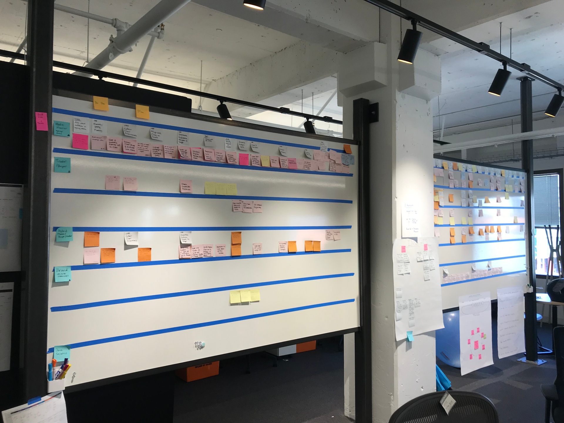
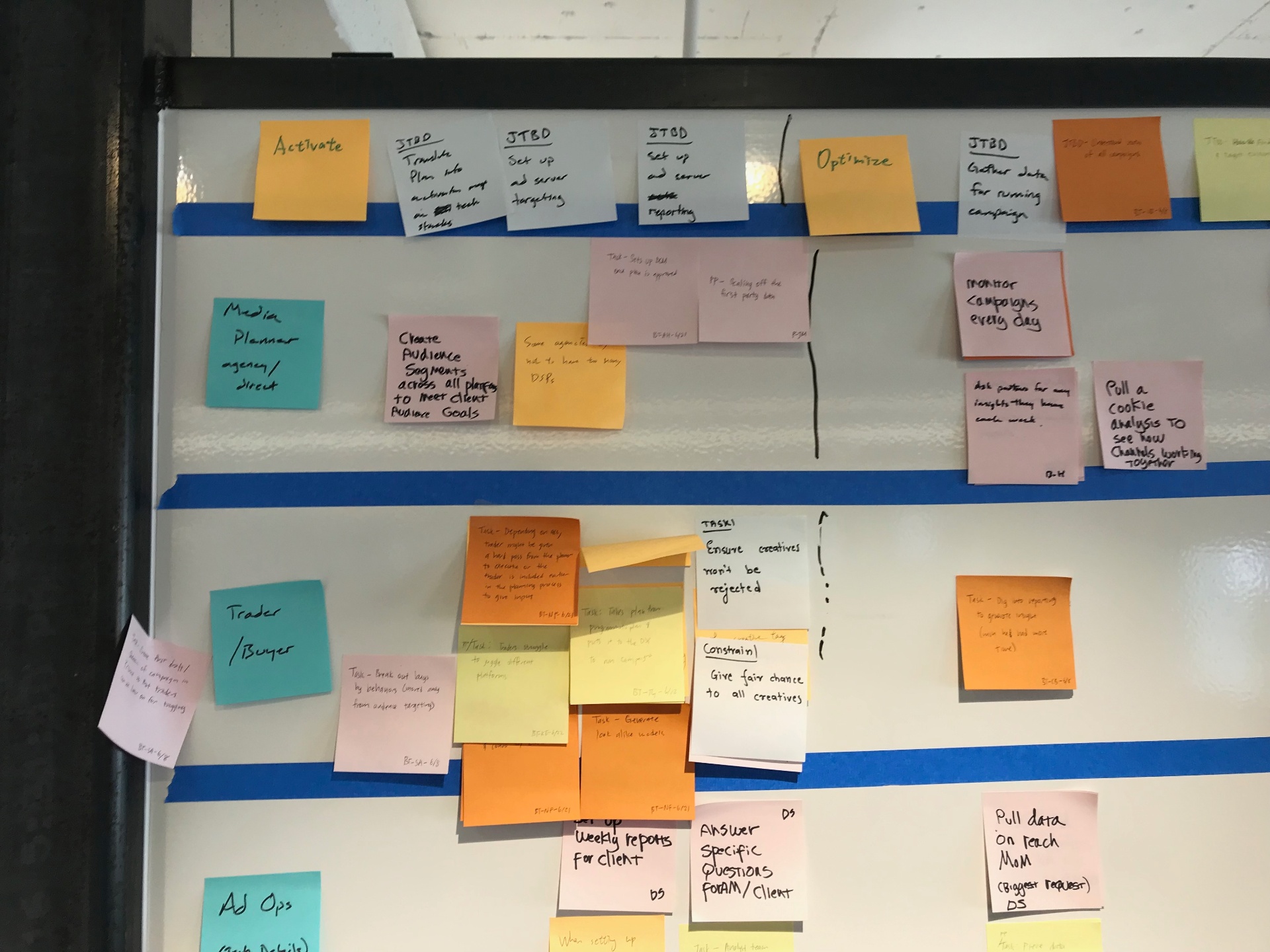
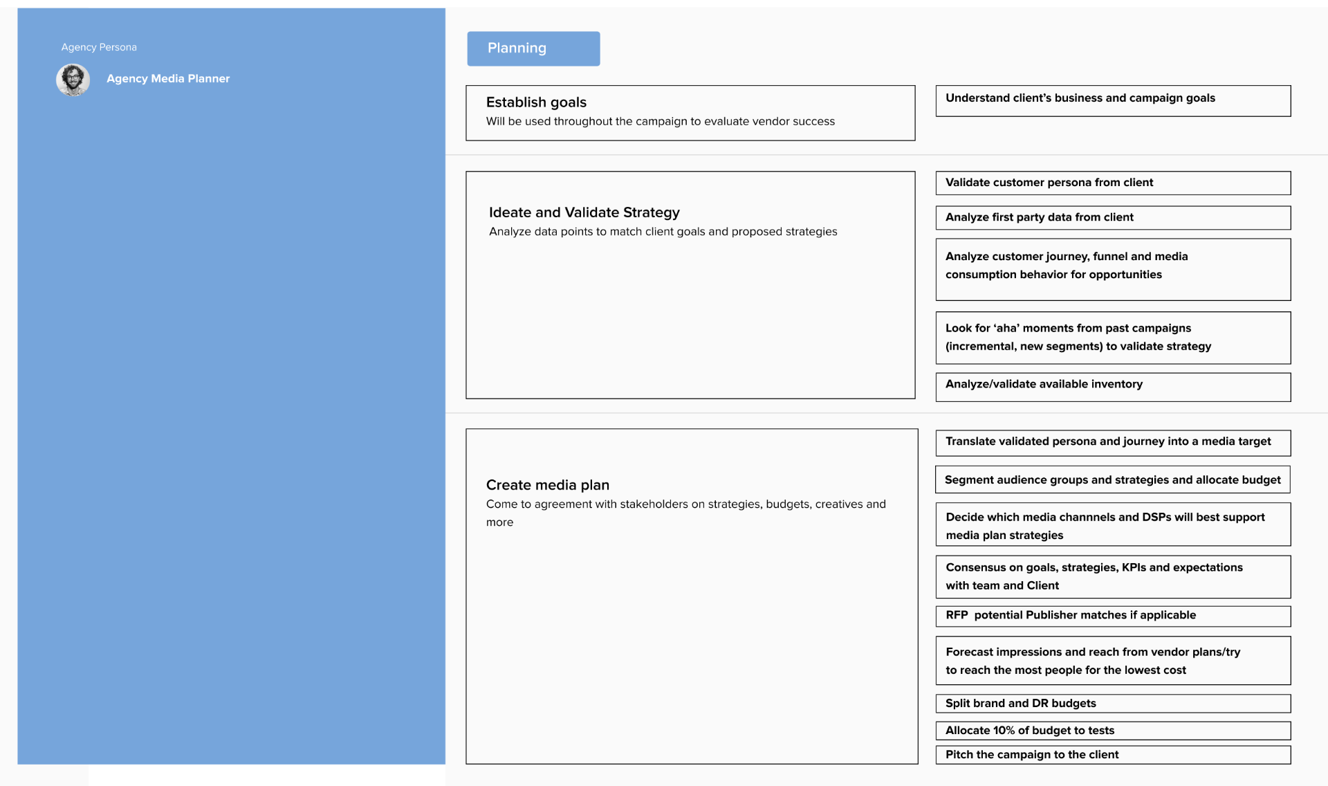
I converted the sticky wall into a living document with tasks that were validated, broken down by persona and phase
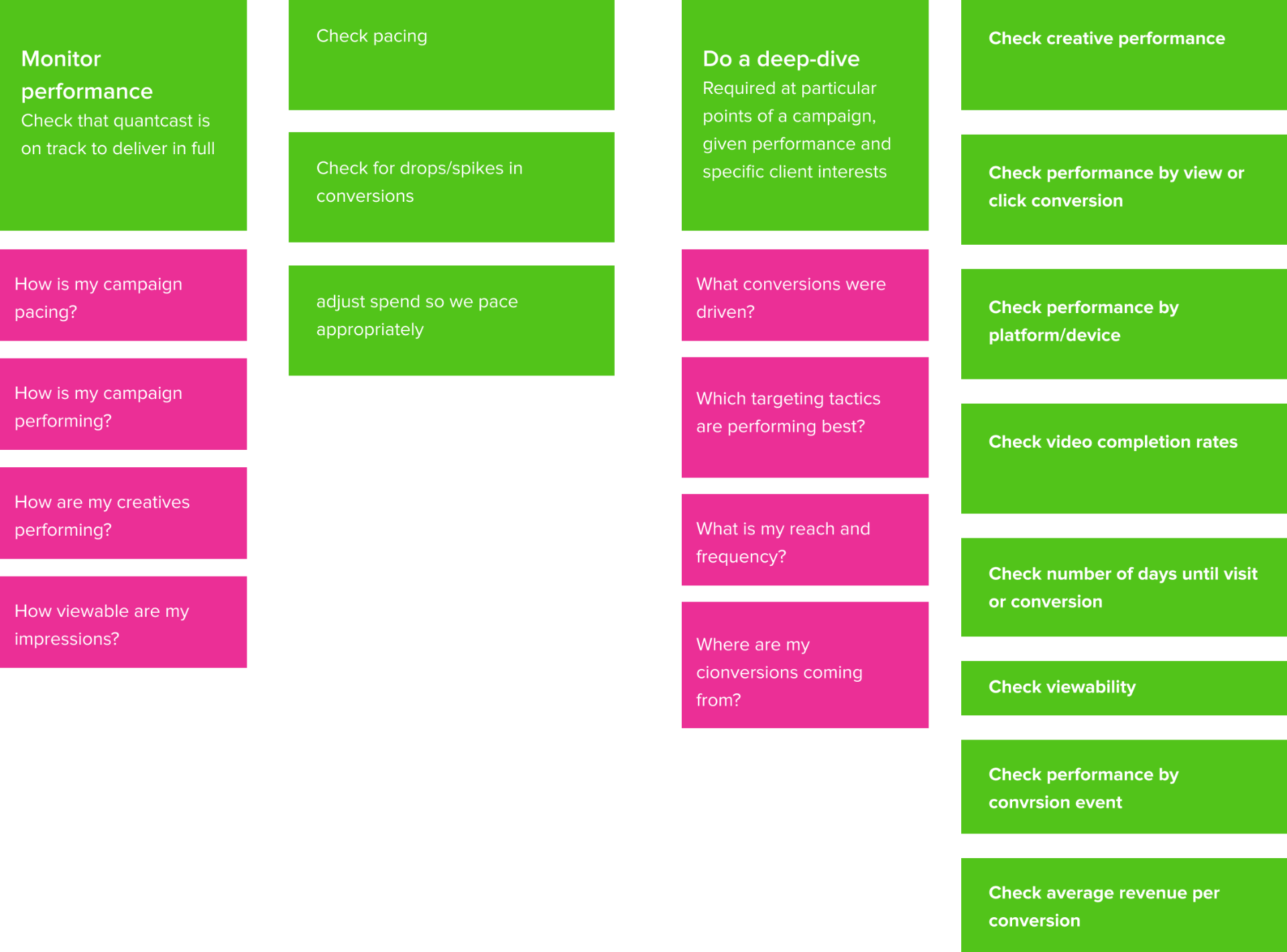
For each important task, I drilled down further

I synthesized tasks that ran across phases and personas into larger buckets, then drilled down on each of those workflows
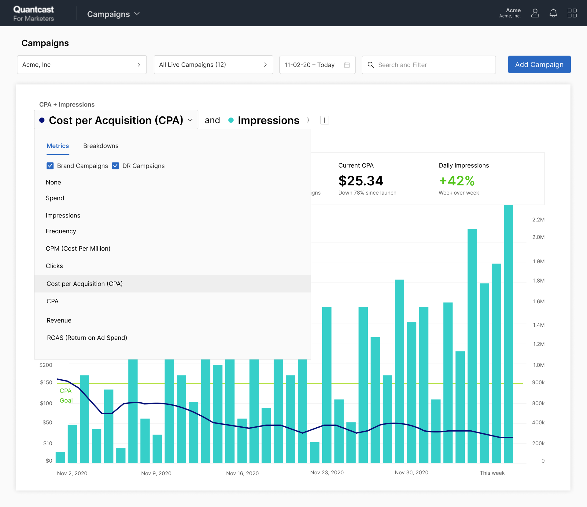
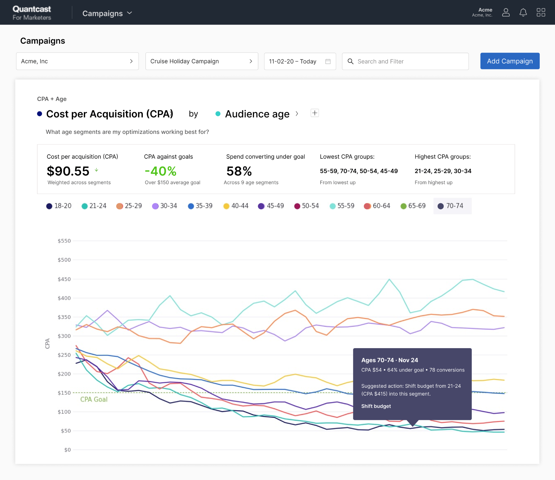
From "select a template" to "which creatives are performing best?"
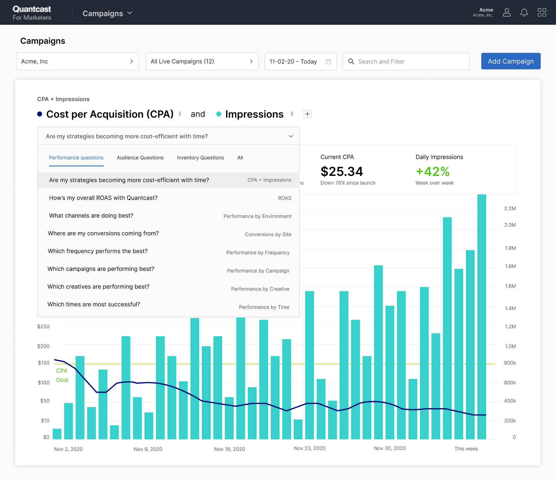
Before, getting answers meant either filling out a report-builder modal (pick an account, a campaign, a template called "all metrics and breakdowns," which assumed you already knew what report you wanted) or a blank slate flow with an overwhelming number of technically-named dropdowns and tools.
Research showed most marketers didn't know what was available, or how to answer their questions with the tools .
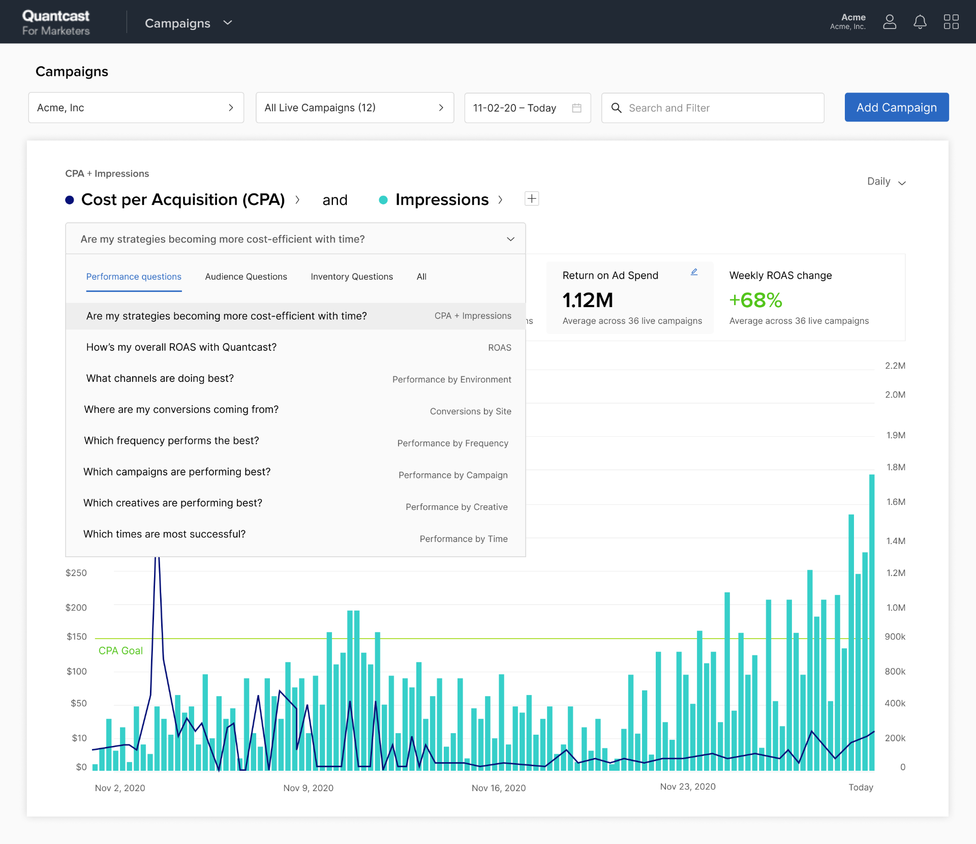
In interviews, marketers didn't ask for metrics — they asked questions. "Which creatives are performing best?" "Are my strategies becoming more cost-efficient over time?" "Where are my conversions coming from?"
So instead of making them translate questions into report configurations, I put the questions themselves in the interface, so a report is never just numbers; it's an answer. And because the question list doubles as a menu of what's knowable, the interface teaches marketers what the platform can do , solving discovery and translation in the same move.
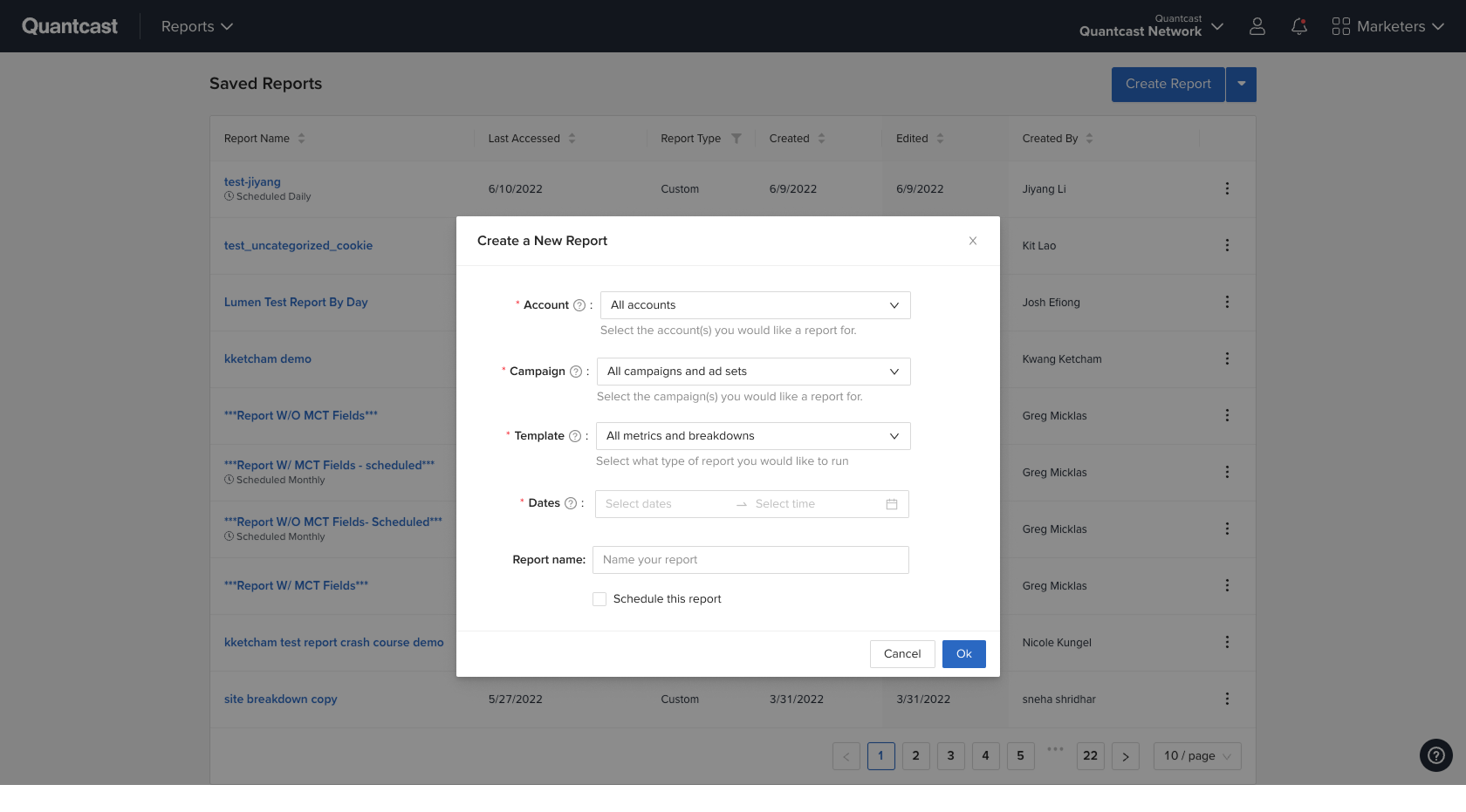
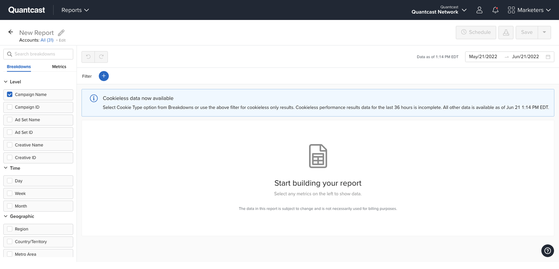
The chain is fully traceable: sticky note on the workshop wall → question in the task-mapping artifact → dropdown item in the shipped product. That traceability was the point of the whole practice.
What shipped, what stuck
A self-serve DSP adopted by brands including Yokohama, Yourtown, and GroupM — and a research practice that outlived the project.
- 01Platform launched 2021 after multiple successful betas; adopted by brands including Yokohama, Yourtown, and GroupM.
- 02Research practice outlived the project: hypothesis-driven cycles standard across teams, designers running discovery alongside PMs.
- 03Design went from service function to strategic input — a seat at visioning, not a stop before handoff.
What started as a redesign became a reorientation of a company toward product truth. What started as a blank slate became a learning machine.
The lesson I carry: organizations don't resist evidence — they resist the cost of obtaining it and the language it arrives in. Lower the cost, translate the language, make the findings physically unavoidable, and the culture moves. No mandate required.
And culture change that depends on its author isn't change — it's a performance that ends when they leave the room. The version that lasted at Quantcast was the one carried by a small, tight design team who learned the template and made it theirs.
Data-driven design became the organizing logic for a product that had lost its shape.
Next case
Prosper →