Trust,tested.
People borrow money at vulnerable moments. Prosper's product treated them like suspects. I rebuilt the design practice around evidence...and the funnel, the brand, and the design system followed.
First design hire
SKELETON CREW
REAL TRUST DEFICIT
+30% funnel conversion
The brief
Can we fix the funnel, the brand, and the site — with no research, no personas, and no design system?
Prosper was one of the first peer-to-peer lenders, but a decade of engineer-led design had eroded trust. Conversion was dropping. An outside agency had found dozens of funnel friction points, then left with the work half-finished and untested. There was no research function and no shared design language.

Role & team
Senior UX Designer, 2015–2016. I was the first design hire after a brand-new director, during a period of rapid growth and funding. I became the senior voice on a fast-growing team — leading research from scratch, driving the visual system and pattern library, mentoring designers, and partnering daily with front-end, PM, and a small design crew that was magically in sync.
- Role
- Senior UX Designer
- Tenure
- 2015 — 2016
- Team
- First design hire under a new director
- Partners
- Front-end · PM · research (later)
Impact
Ship first, earn the room
Define a new brand. Make it responsive. Make it convert. Don't change the layout too much. And ship it in eight weeks.
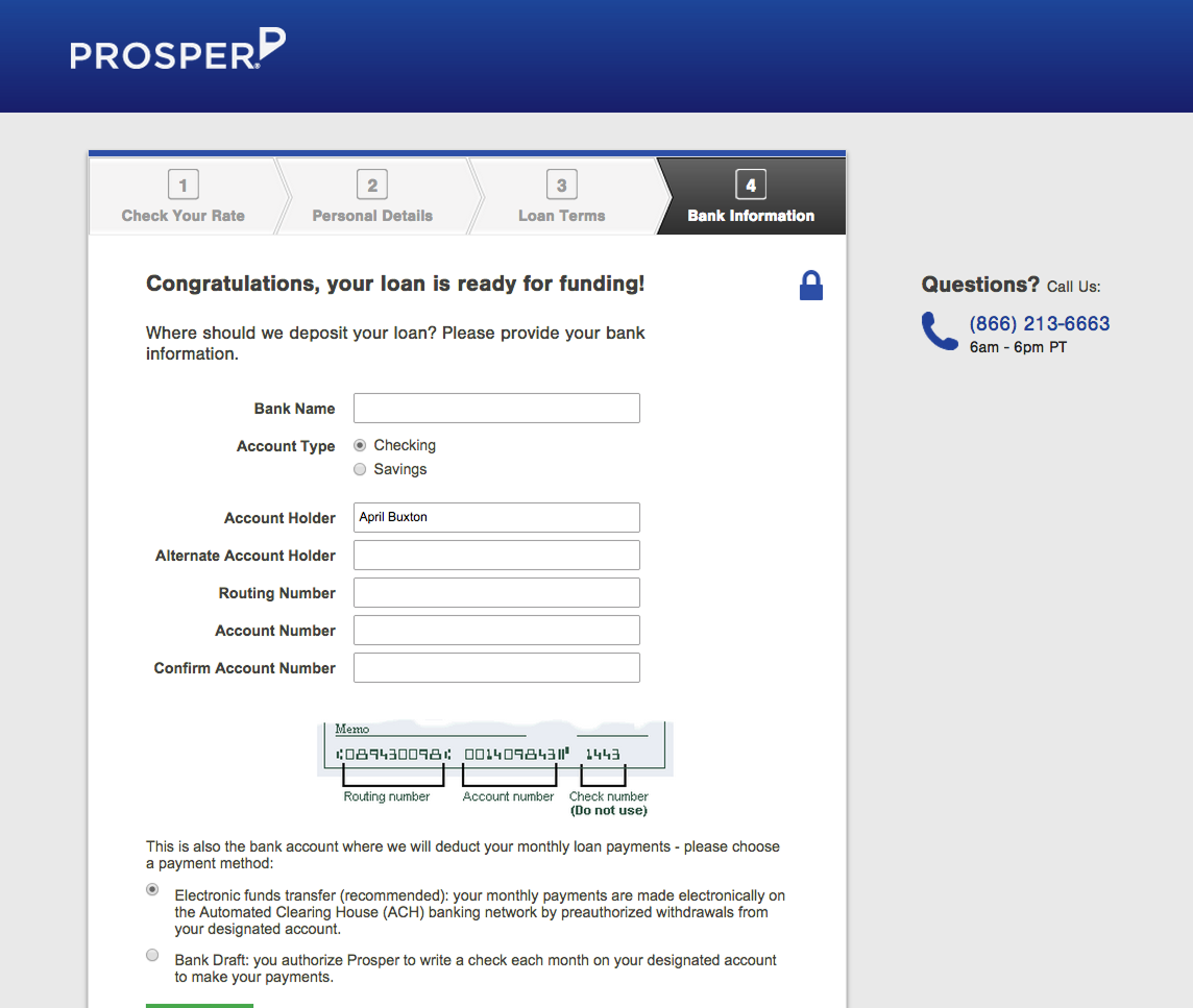
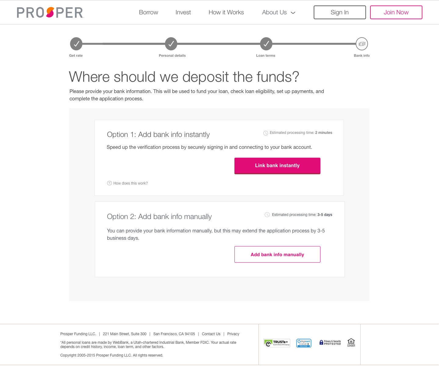
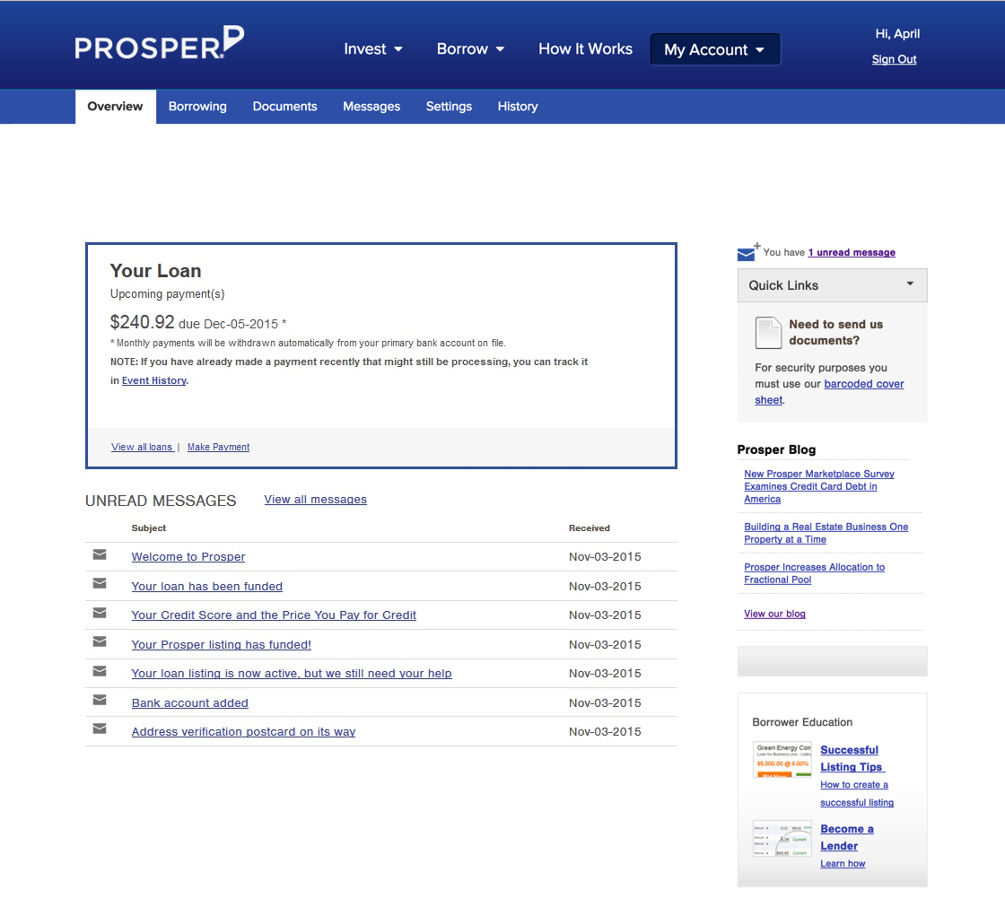
I launched a responsive redesign of the borrower funnel, homepage, and partner pages within the first months of my tenure, under a constraint that made it interesting: figure out the visual language of a new brand, make it responsive and make it convert. It shipped on schedule.
I opened, prioritized, and tracked 160 bugs through release to keep it honest.
Building the evidence engine
For the first 6 months of my tenure, Prosper had no researcher, so I became one — and then built the foundation of a real research program into how we worked.
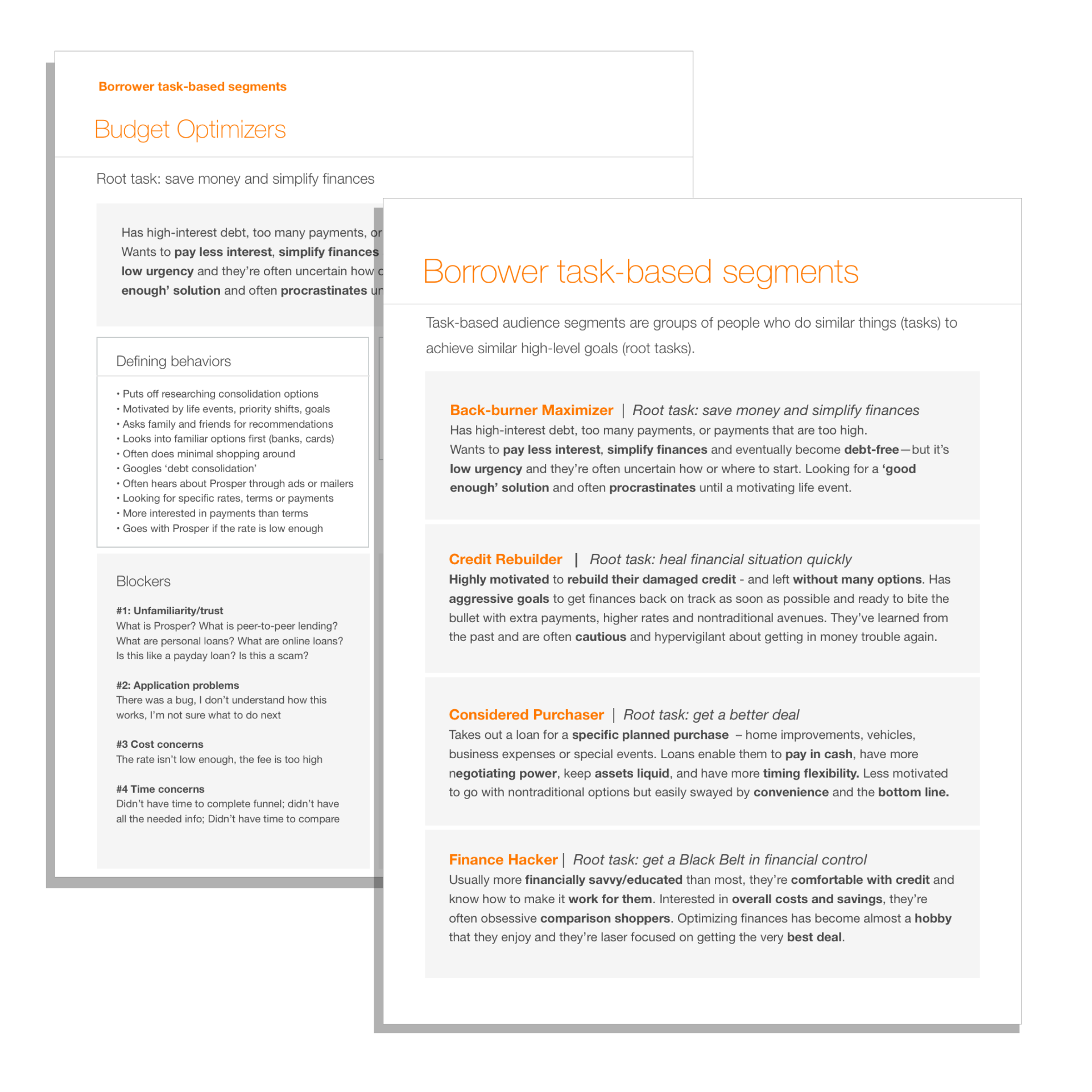
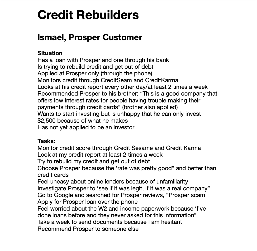
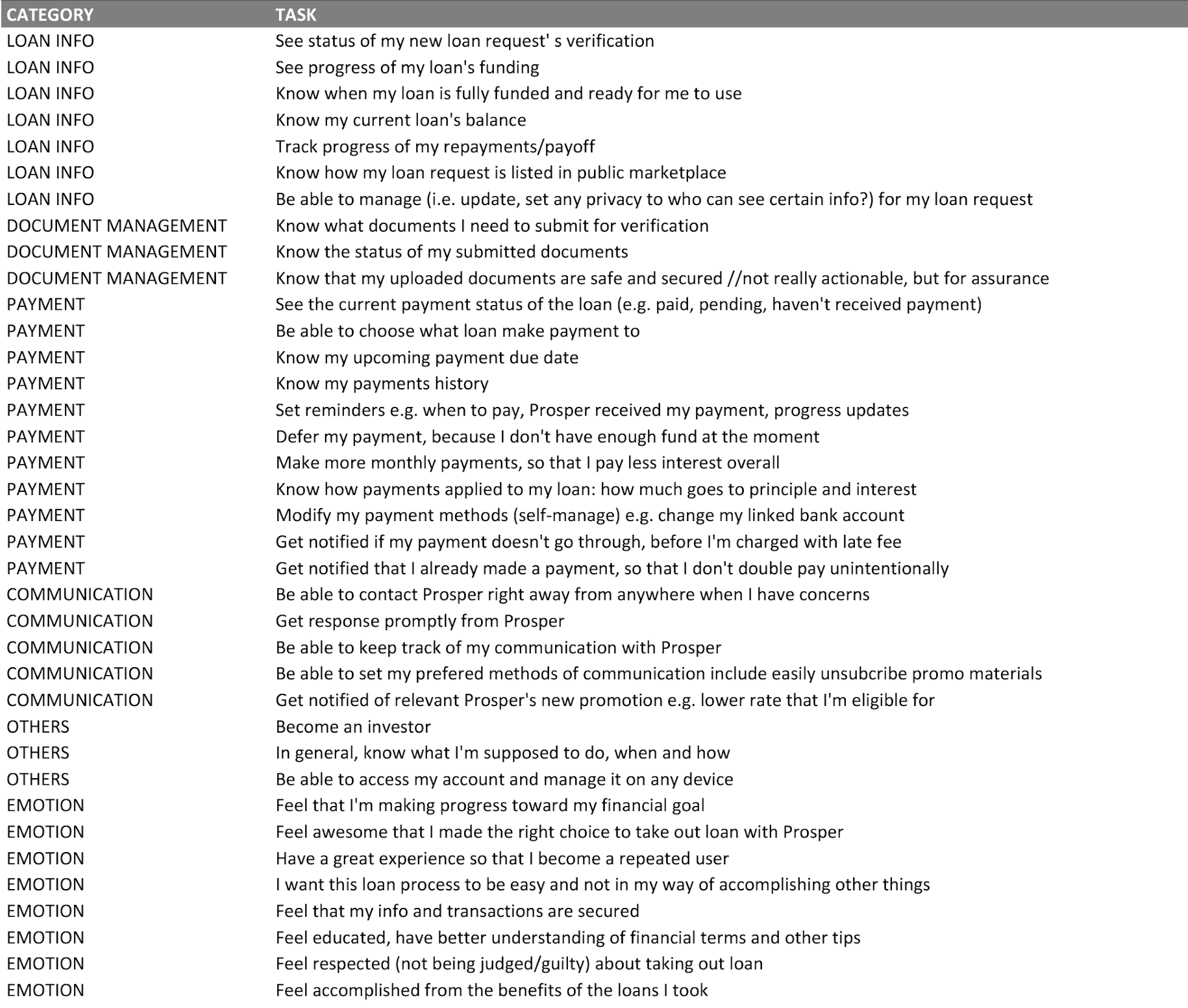
I planned and ran dozens of customer interviews, analyzing them into task models, experience maps, drivers, and blockers — and from those, four task-based borrower segments the whole company could reason with.
As we grew, I helped hire dedicated researchers — great ones — and collaborated with them heavily. They didn't have to fight for a seat at the table, because research was already wired into our process by the time they arrived.
- Back-Burner Maximizers
- Considered Purchasers
- Credit Rebuilders
- Finance Hackers
Task-based, not demographic. A shared vocabulary the whole company could reason with.
What the interviews kept surfacing
The research kept surfacing the same thing, and it wasn't a usability finding.
Borrowers were afraid. Afraid of scams. Afraid of judgment. Afraid of a process they couldn't see into.
You cannot A/B test your way out of that with button colors. Trust had to be designed in deliberately: plain language, a visible process, and small kindnesses in every form field.
I don't want to get screwed up by Prosper.
I want to feel respected — not judged or guilty — about taking out a loan.
Verbatim from task research · EMOTION rows
The rebrand ran through the same engine
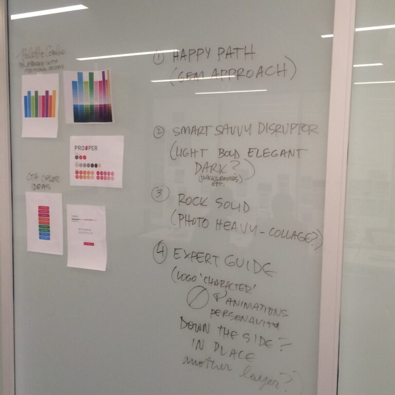
I helped lead a one-week brand exploration workshop, contributed two of the visual concepts myself, and then designed and ran qualitative testing of six design concepts with real prospective borrowers.
The testing killed our darlings early. It gave the team decisions instead of debates.
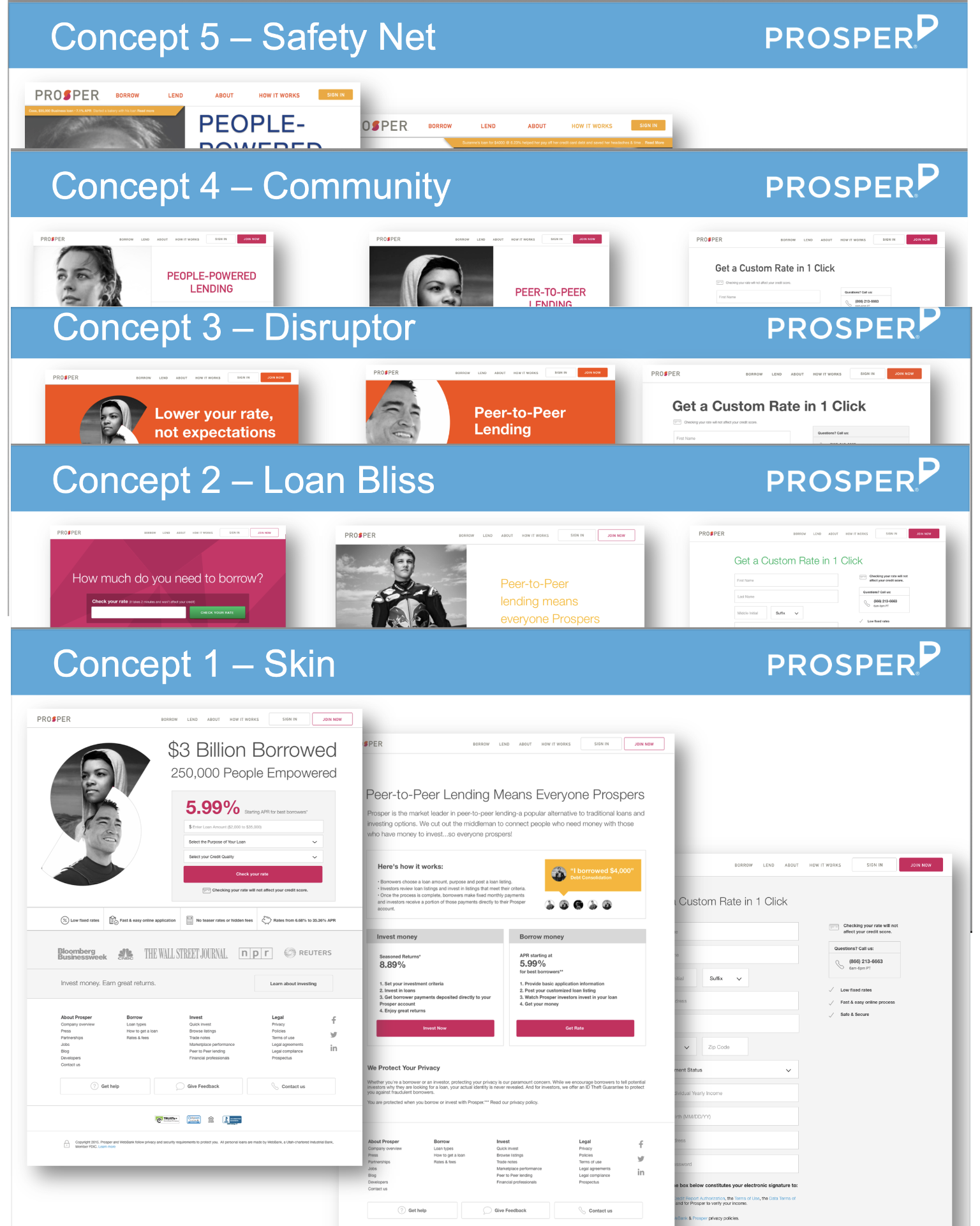
What testing loved
Unanimously, a humanistic, photo-driven style that made the community visible.
Real faces. Real borrowers. The community had always been Prosper's story — it just hadn't been on the page.
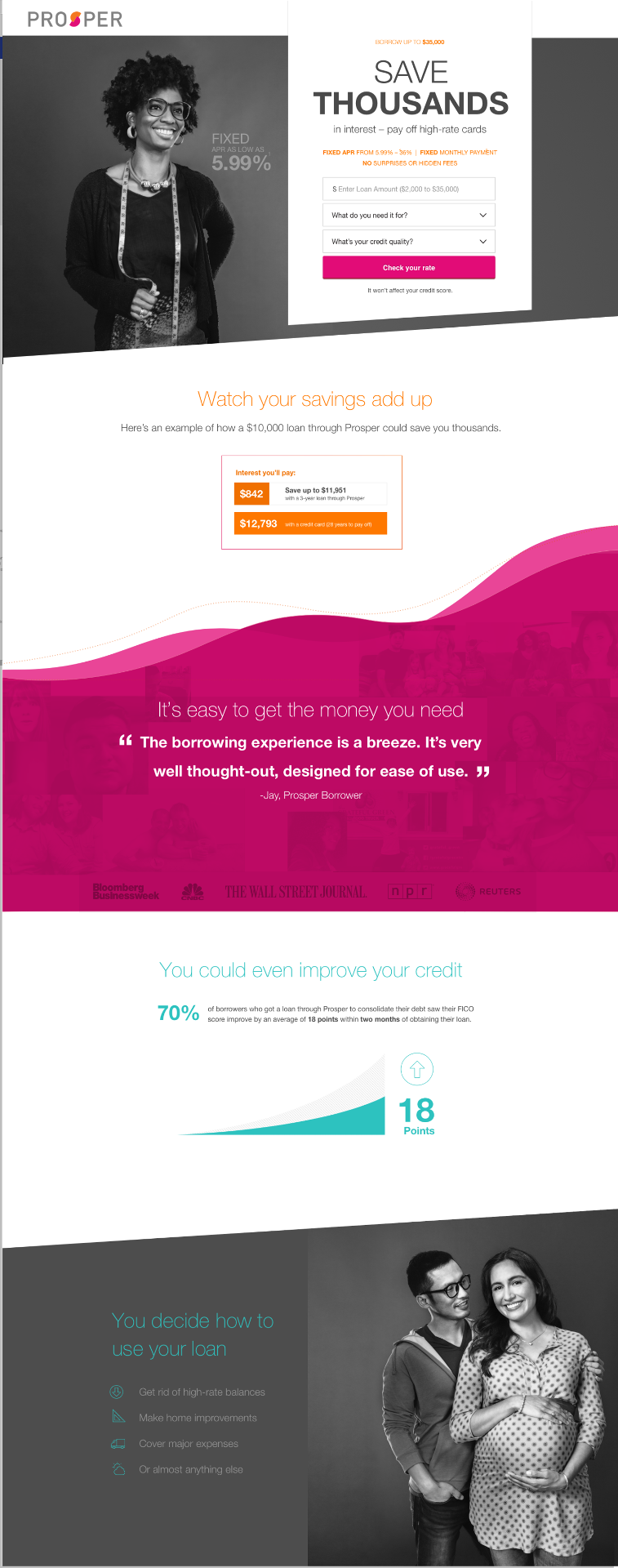
The system, and the practice around it
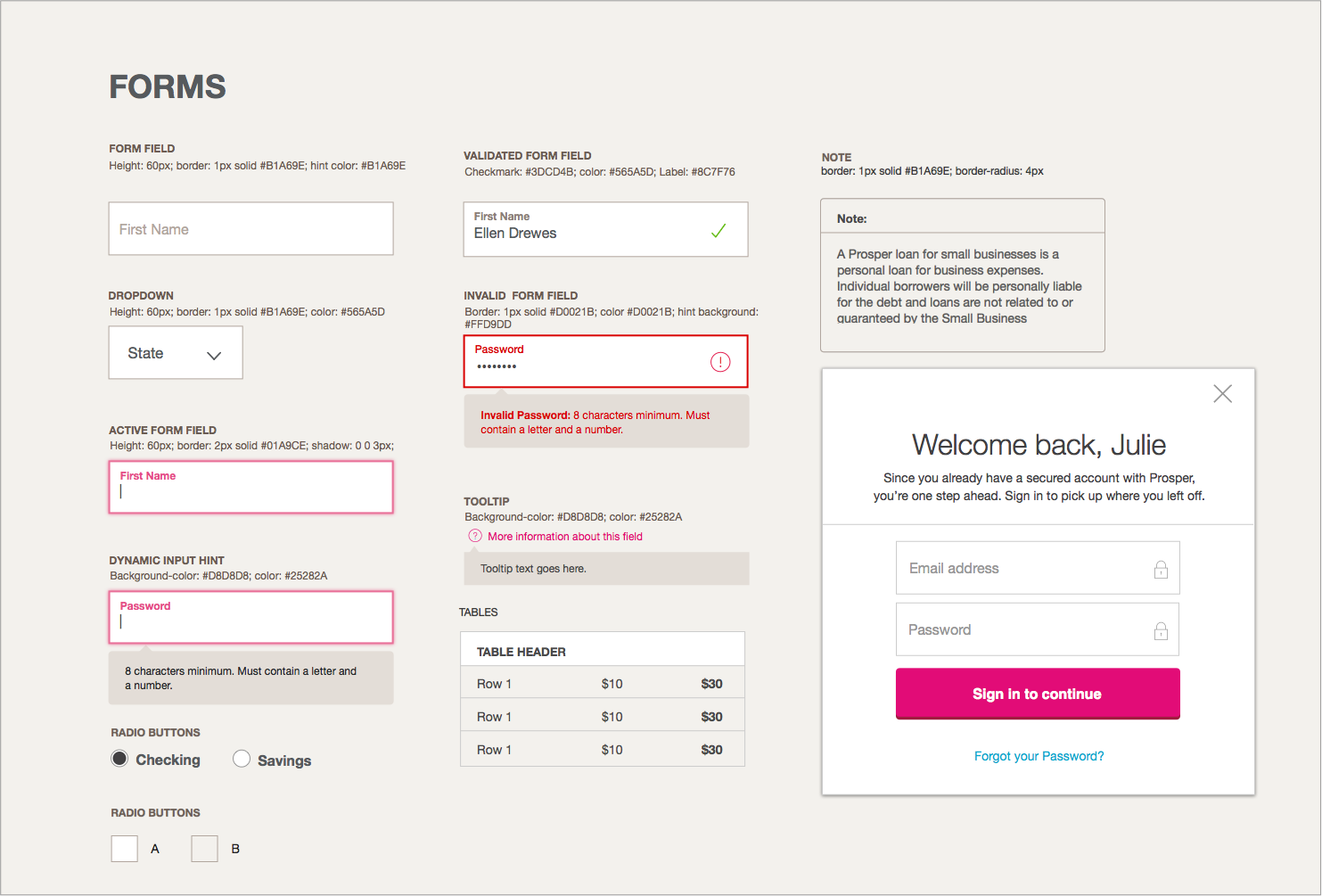
To make it all stick, the artifact had to become a practice.
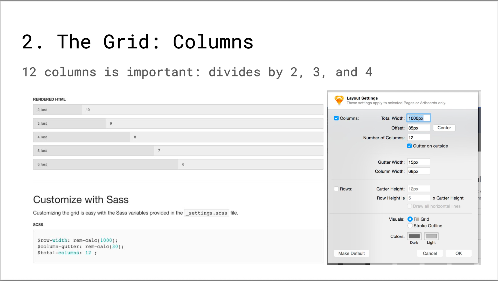
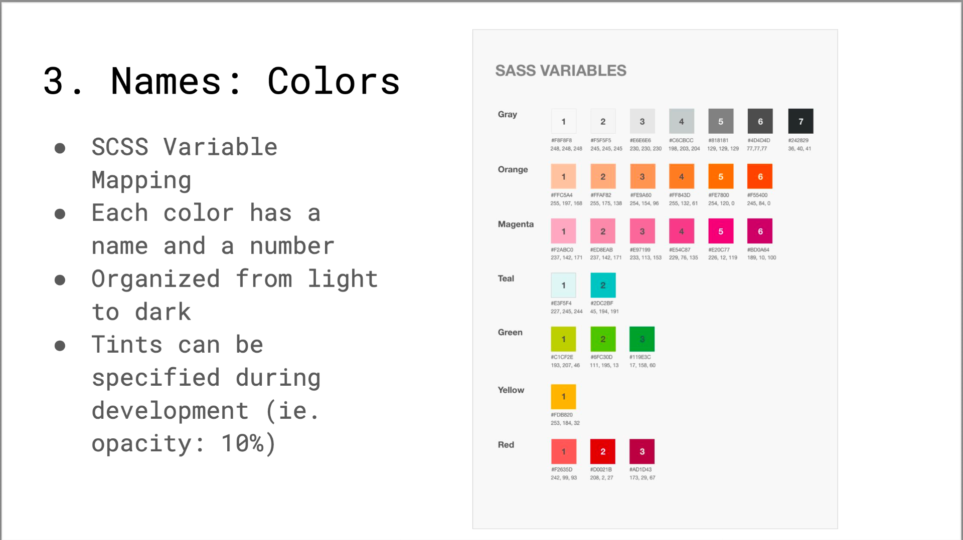
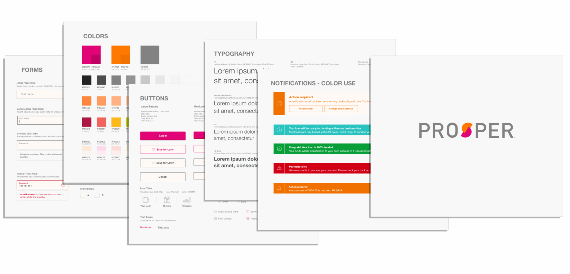
I partnered with a senior front-end developer to build an atomic-design-inspired style guide — and, more importantly, the practice around it.
- 01Regular working sessions between design and front-end.
- 02A process for getting new components into both the codebase and the design toolkit.
- 03Enforcement at design reviews.
Those patterns and layouts are still in use ten years later.
Designing endorphins into debt
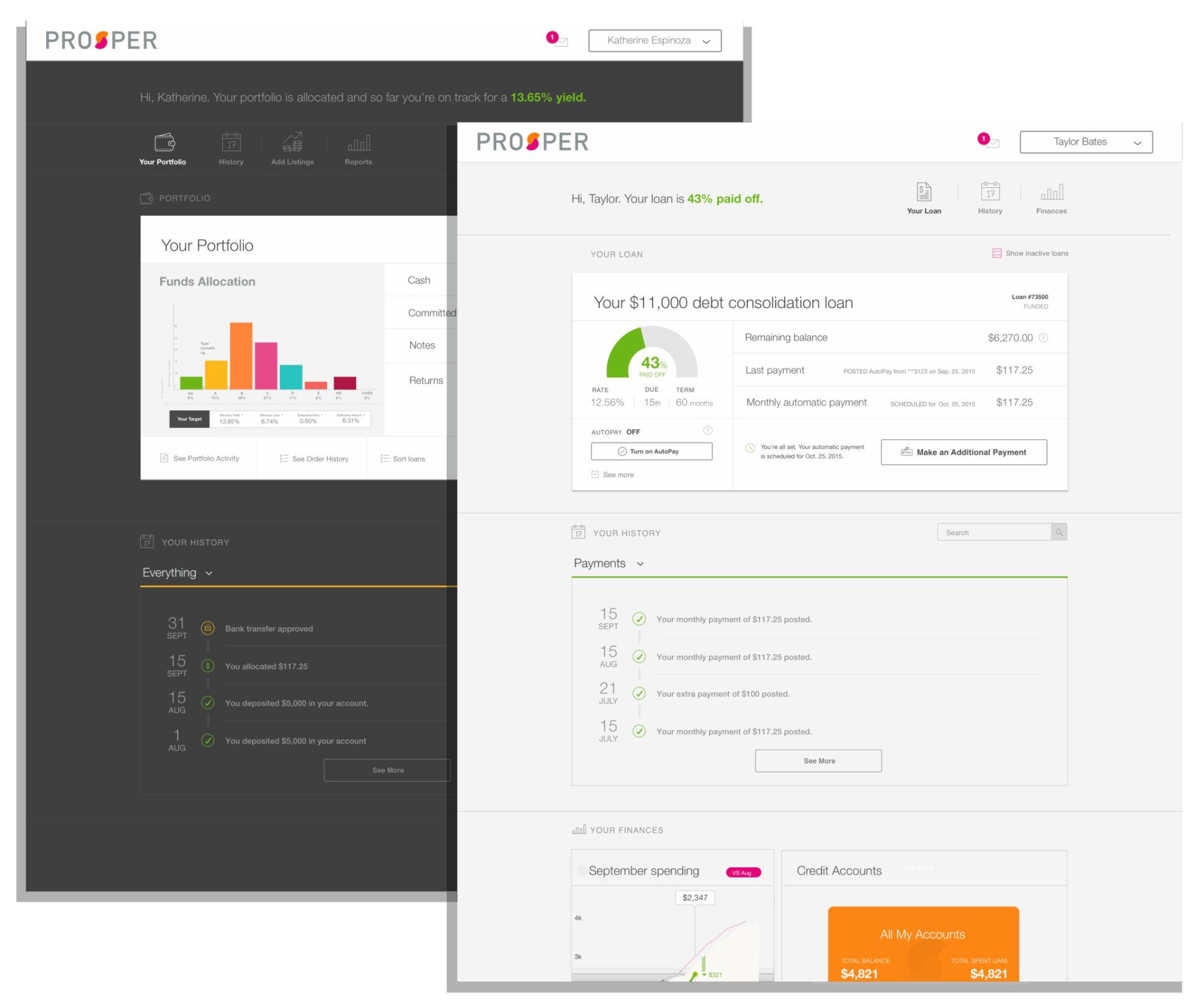
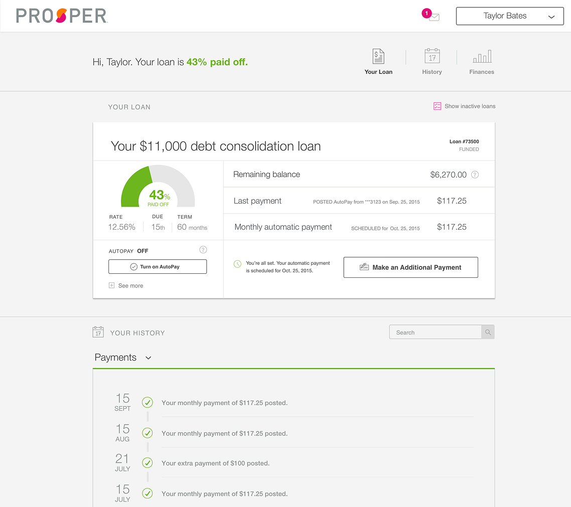
Sitting in the task research was a row nobody would think to design for: Feel that I'm making progress toward my financial goal.
Repaying a loan is the least glamorous surface in a lending product — a chore page, a place people arrive stressed and leave guilty. When I redesigned the repayment and account experience, I treated those emotions as requirements.
The page led with a big, unmissable progress graphic — your loan is 43% paid off — and payments rendered as a visible history of wins, each one confirmed like a small achievement rather than a receipt. Tiny endorphins, deliberately placed, in a task built around obligation.
Trust isn't a coat of paint on acquisition — it's a property of the whole relationship. Same thesis as the funnel, pointed inward.
Turning design into a hypothesis machine
After the redesign shipped, I didn't stop at done. I analyzed our usability tests, interviews, customer complaints, surveys, and past A/B data into a library of borrower pain points — then designed a backlog of 30 experiments against them, running through Optimizely with my PM partners on a weekly cadence.
Every experiment traced back to something a real borrower had said, and every one stated its bet up front: what we believed, what we'd change, what we'd measure.
Four bets, each traceable to a borrower
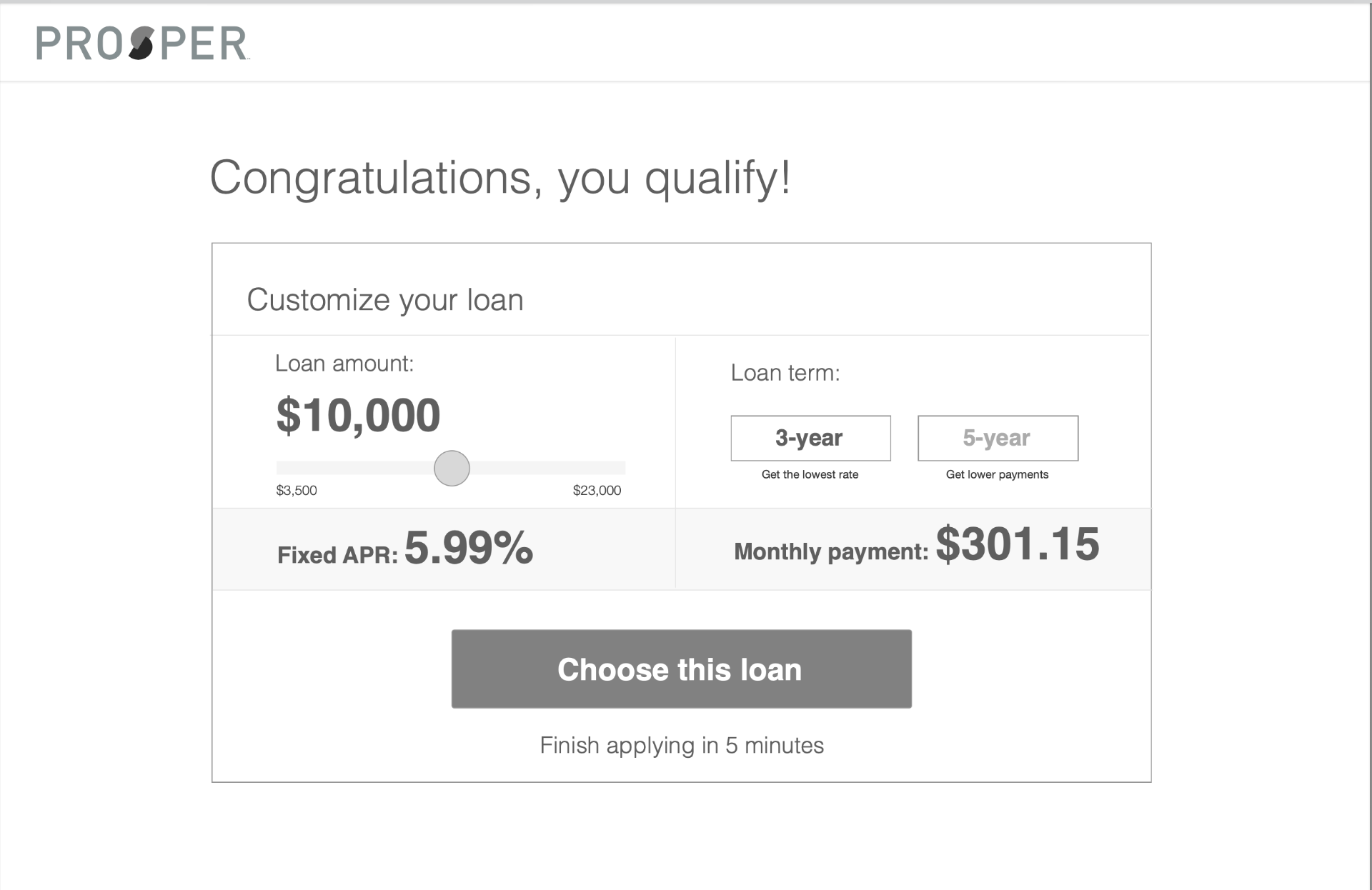
Create your own loan
HypothesisShoppers are comparing options — so let them manipulate amount, term, and payment directly instead of choosing between two fixed cards.
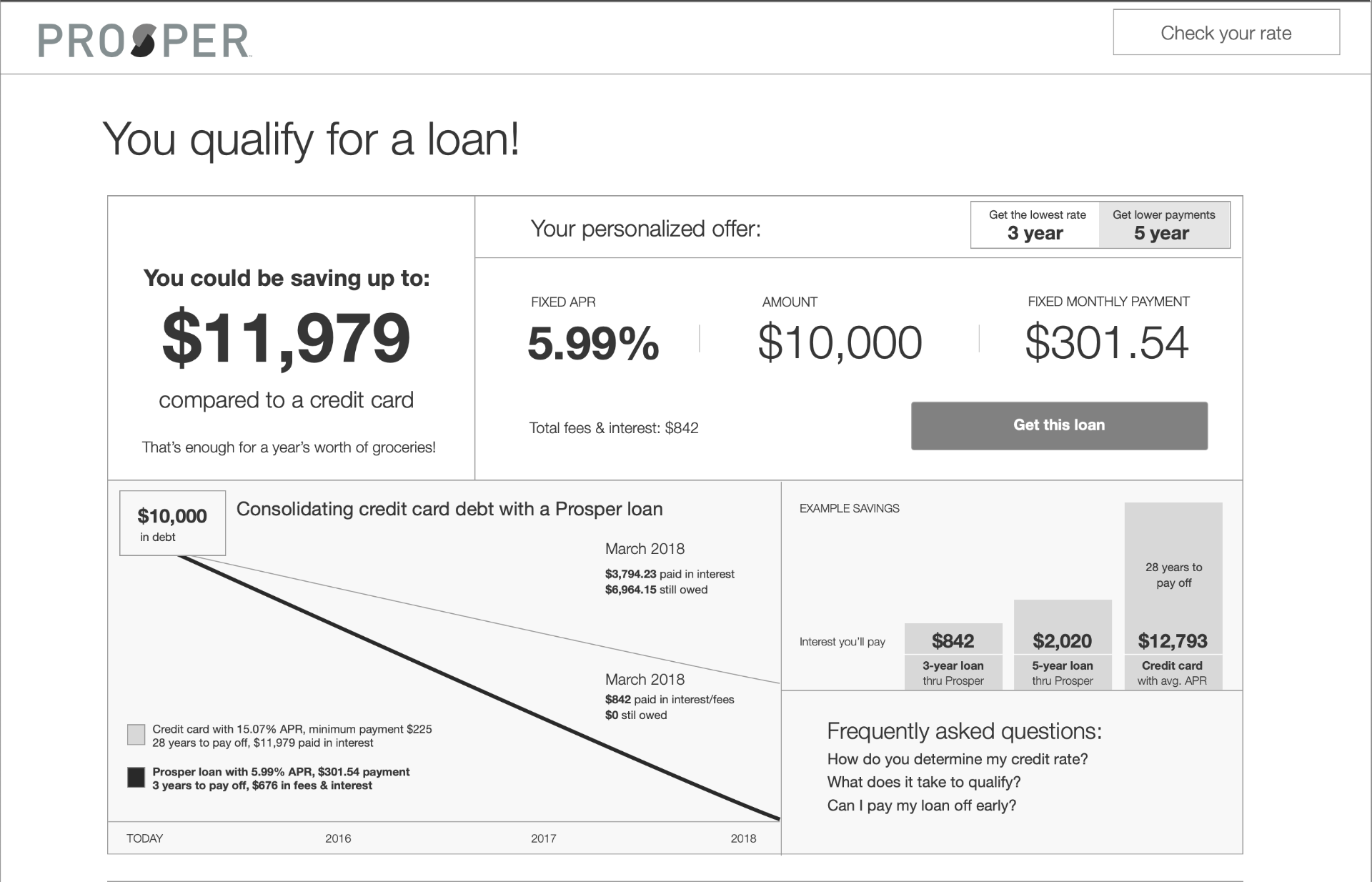
Personalized savings
HypothesisA rate is just a means to an end. Show people what they'd actually save, in human terms — 'that's a year of groceries' — instead of making them do math.
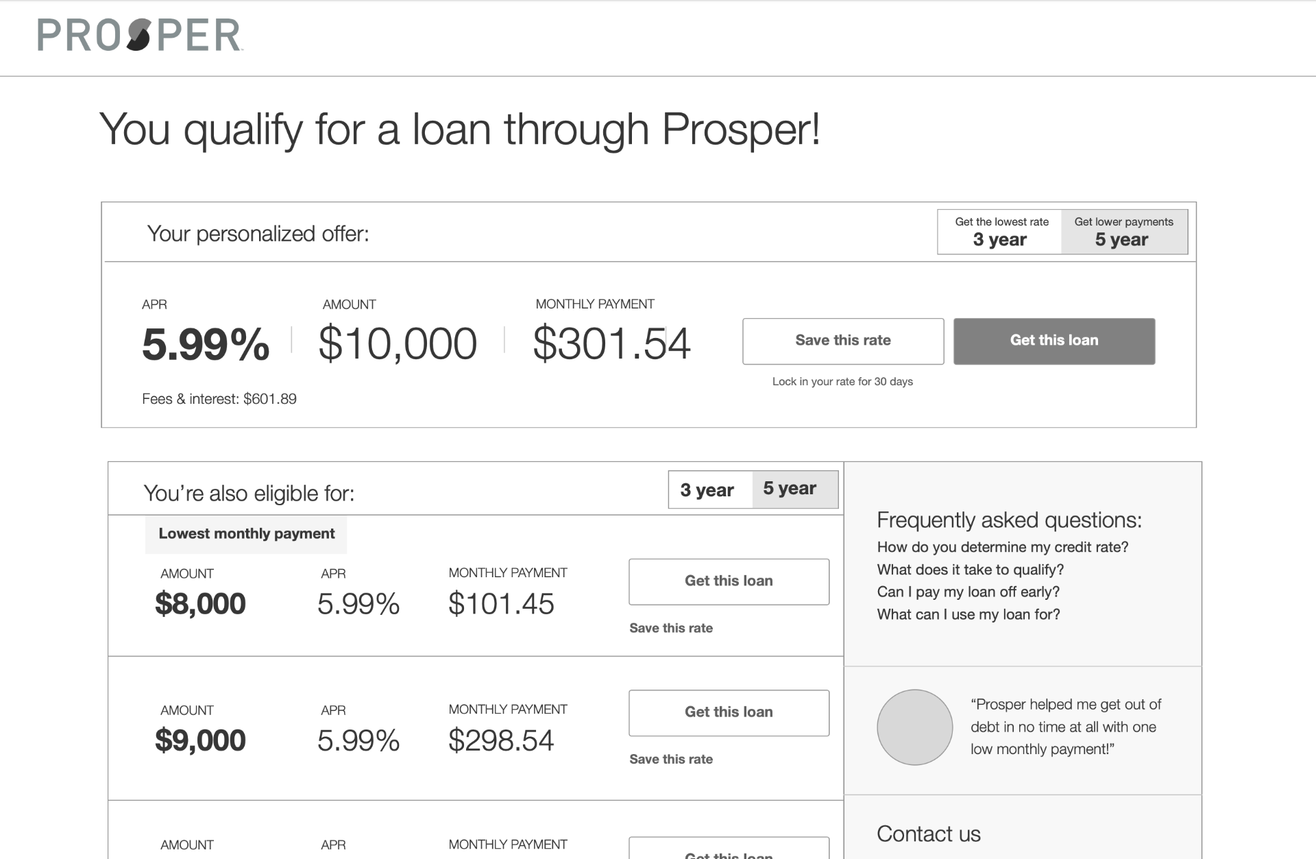
The loan shopper
HypothesisMany qualified people aren't ready to commit today. Let them save their rate for 30 days instead of losing them forever.
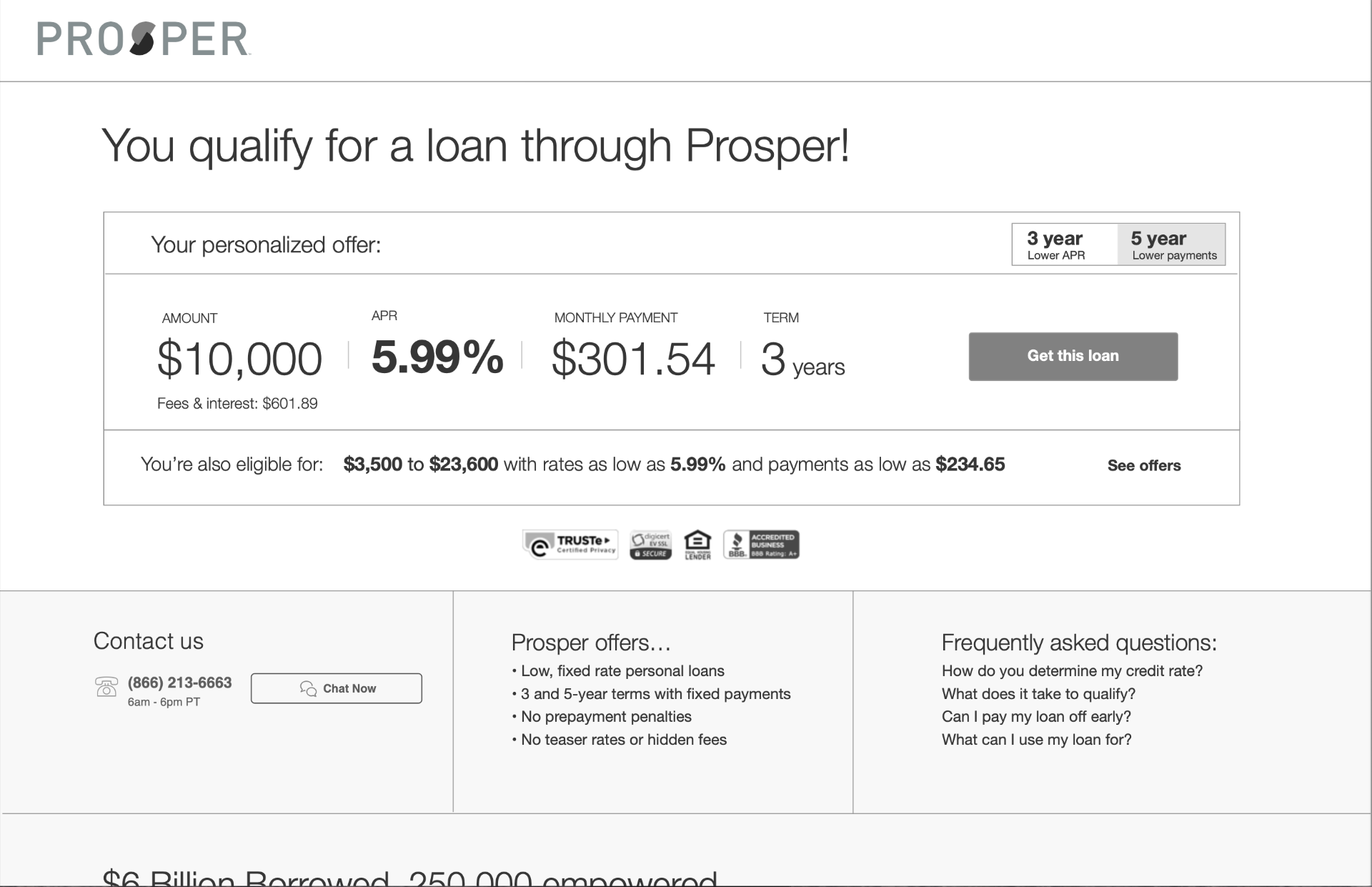
Trust building
HypothesisThe biggest blocker in the research was fear of the unknown. Put transparency, a real phone number, and real borrower stories on the offer page itself.
Outcome
- ●Over 30% lift in funnel conversion following the redesign.
- ●Loan defaults improved following the repayment experience redesign.
- ●Foundational research adopted into every major borrower project; usability testing integrated into project timelines.
- ●Design system, patterns, and layouts still in use ten years later.
- ●Over 100 pages migrated to a CMS that stakeholders could own themselves, clearing hours from dev backlogs.
The redesign is what people saw.The evidence practice is what made it work — and what outlived it.
Next case
Cornerstory →